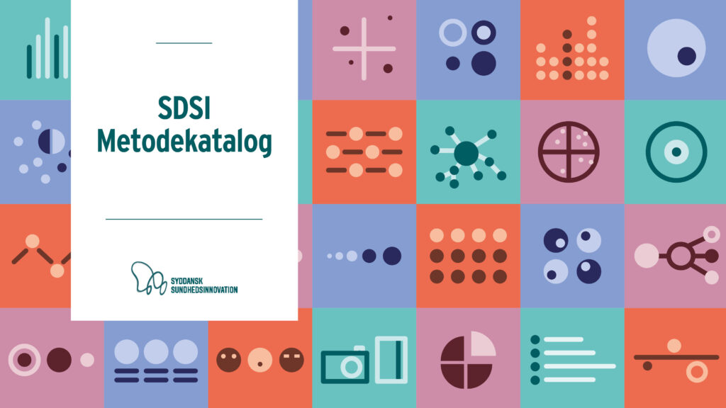
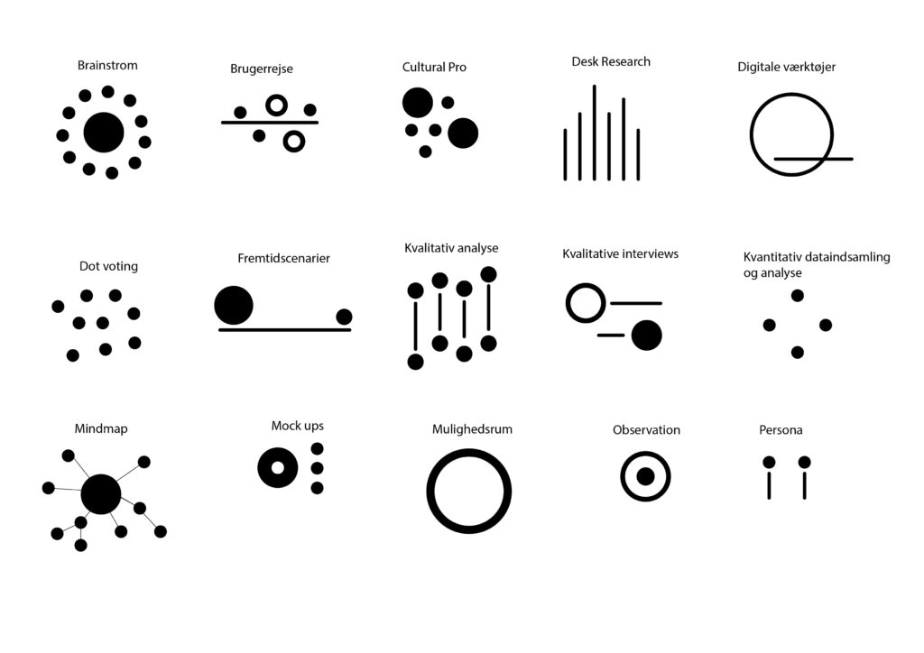
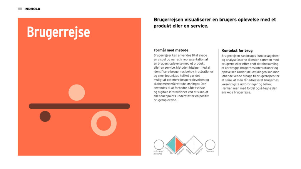
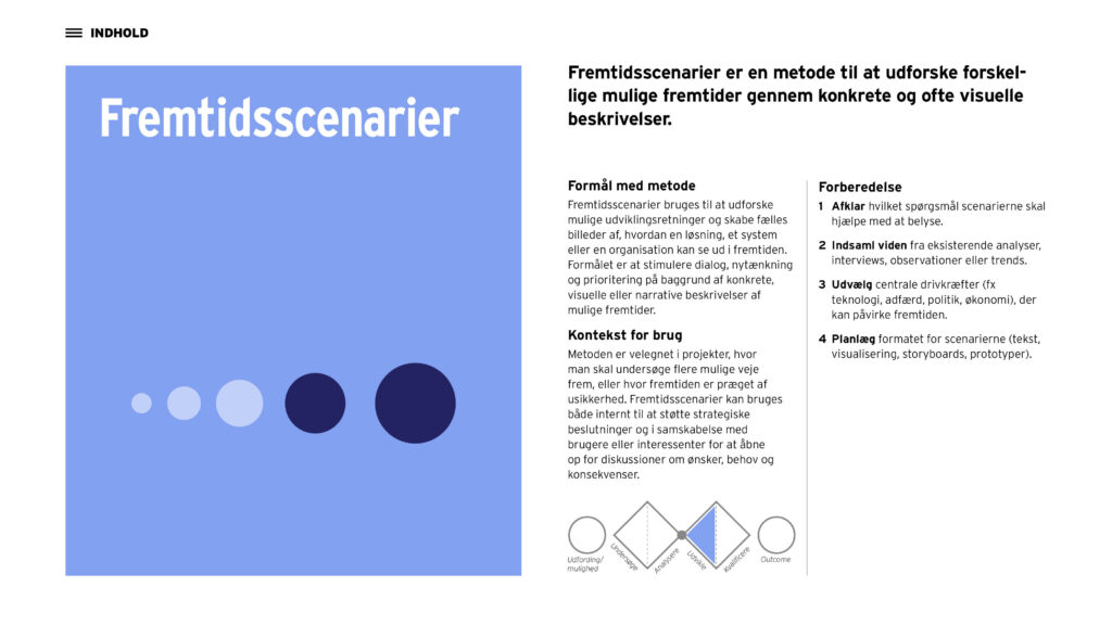
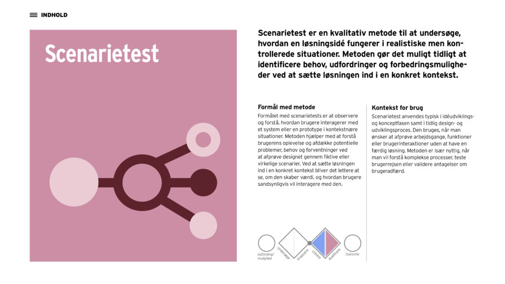
I developed a series of icons for Syddansk Sundhedsinnovations’ methodology catalogue, visually communicating a range of different working methods. With a focus on simplicity and recognisability, I translated complex models and concepts into a clear and accessible visual language.
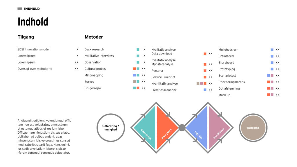
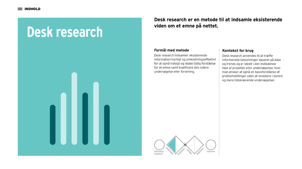
I also contributed to developing and setting up the overall graphic layout of the catalogue. The colour palette was developed using Syddansk Sundhedsinnovations’ existing brand colours, with a focus on creating a balanced and cohesive colour system. The project combines information design, illustration and graphic design to make the methods more accessible and easy to understand.